


Dallas Mobile-Friendly Web Design & Development

Responsive Websites That Perform Beautifully on Every Device

Big D Creative builds responsive, mobile-optimized websites that deliver an excellent experience whether your Dallas visitors are on a phone, tablet, or desktop. We ensure fast load times, intuitive navigation, and strong conversions across all screen sizes.

bigdcreative-web-design-presentation3

Dallas Mobile-Friendly Web Design & Development Done Right​

In today’s world, most people discover and interact with websites on mobile devices. We build responsive websites that look great and perform exceptionally well on every screen size — without sacrificing desktop quality.

Why We're the Best Dallas Mobile-Friendly Web Design & Development Company

A great mobile experience is no longer optional — it’s expected. Here’s why Dallas businesses choose Big D Creative when they need websites that truly work for today’s mobile-first audience.

We create fully responsive websites that adapt perfectly to any device. Our Dallas web design and development team ensures your site maintains excellent usability and visual appeal whether viewed on mobile, tablet, or desktop.

We optimize every website for speed on mobile networks. Fast-loading pages reduce bounce rates and improve user satisfaction for your Dallas audience.

We design intuitive, finger-friendly navigation and interactions that make it easy for visitors to find information and take action on smartphones.

Google strongly favors mobile-friendly websites. Our responsive web design helps your site rank better in both traditional and local Dallas search results.

With over 1,500 websites launched, we have extensive experience delivering mobile-optimized websites that drive real engagement and conversions for Dallas businesses.

Our Proven 6-Phase Dallas Mobile-Friendly Web Design & Development Process

Our structured process ensures every website we deliver is truly responsive. Here are the specific types of mobile-friendly web design and development solutions we specialize in for Dallas businesses.

1. Discovery

We analyze how your Dallas target audience uses mobile devices and identify the key features and content they need on phones and tablets.

Step 2: Planning

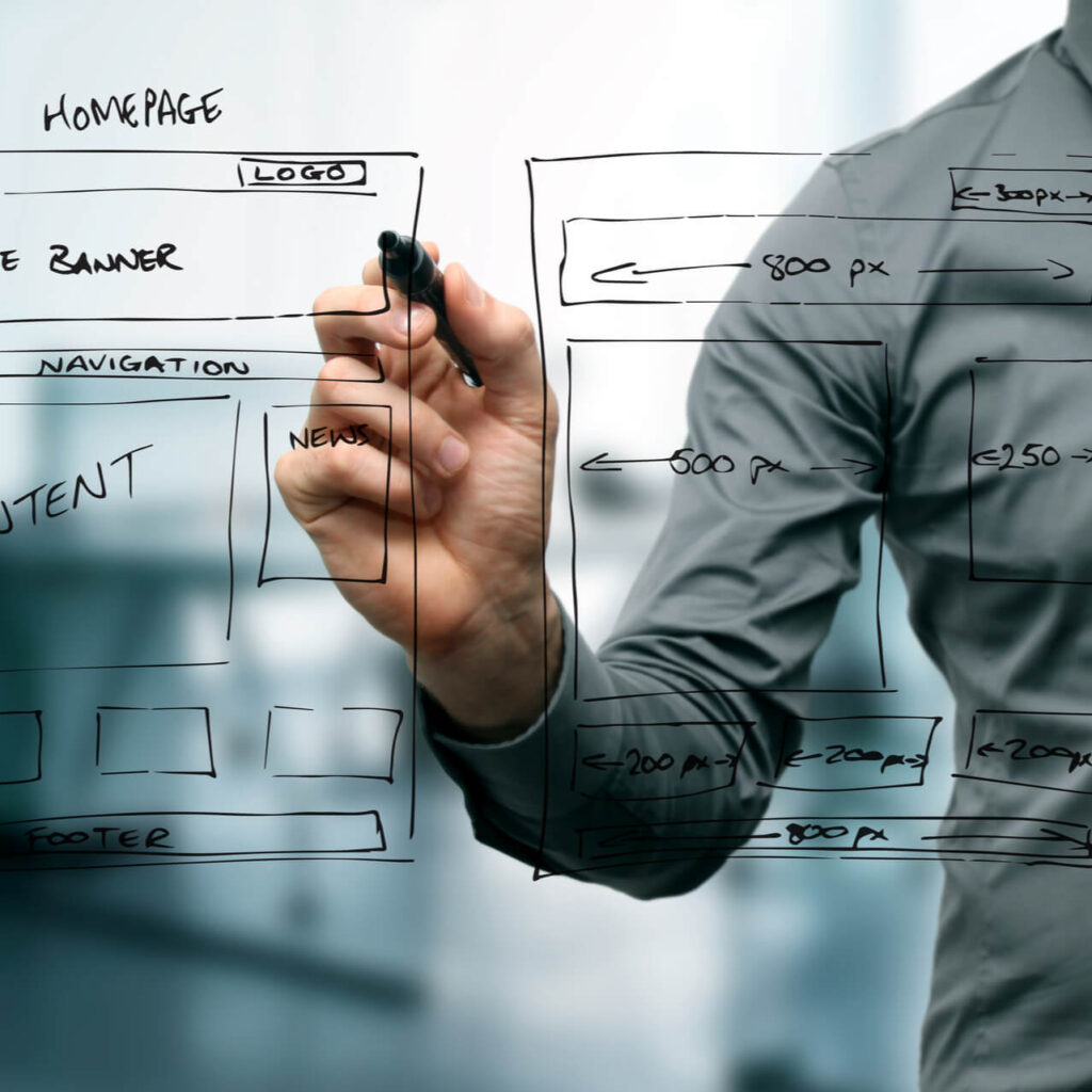
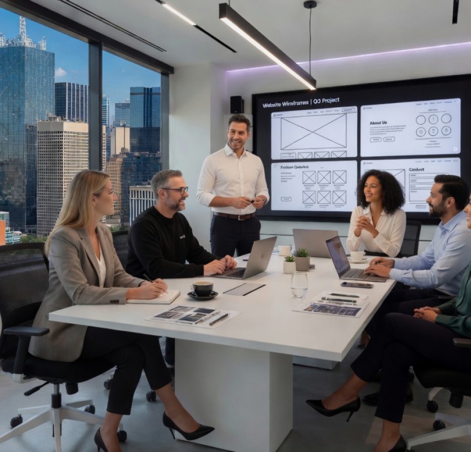
We create responsive sitemaps and wireframes that prioritize mobile usability while ensuring the desktop experience remains strong.

3: Design

Our designers craft layouts that look polished on every screen size, with special attention to mobile typography, button sizes, and touch interactions.


4. Development

We build responsive websites using WordPress or Shopify with clean, efficient code that delivers excellent performance across all devices.

5. Testing

We test extensively on real mobile devices, tablets, and desktops to ensure flawless functionality, speed, and user experience everywhere.

6. Launch & Training

We launch your responsive website and provide training so your team can confidently manage content across all devices.

Most projects launch in 8-12 weeks.

Ready for a Website That Works Great on Mobile?

Don’t lose visitors because your site doesn’t perform well on phones.

Our Dallas Mobile-Friendly Web Design & Development Specialities

Our structured process ensures every website we deliver is truly responsive. Here are the specific types of mobile-friendly web design and development solutions we specialize in for Dallas businesses.

Fully Responsive Websites

We build websites that automatically adapt to any screen size, delivering an optimal viewing and interaction experience on mobile, tablet, and desktop.

Shopify Mobile Experiences

For larger ecommerce solutions, we develop highly responsive Shopify stores that perform exceptionally well on smartphones and tablets.

Mobile-Optimized WordPress Sites

We create fast, user-friendly WordPress websites with mobile-first considerations built into the design and development from the beginning.

Mobile Speed Optimization

We focus on fast mobile load times through image optimization, efficient code, and advanced caching techniques.

Mobile Accessibility & WCAG Compliance

We build mobile-friendly websites that meet current accessibility standards (WCAG and ADA guidelines). Our Dallas web design and development team ensures your site is usable by everyone — including visitors with disabilities — which improves user experience and helps protect your business legally.

Touch-Friendly Interfaces

We design interfaces with larger buttons, easy navigation, and smooth interactions specifically for mobile users.

Progressive Web App Features

Smart product recommendations, intelligent search, automated chat support, and dynamic pricing — all built into your WooCommerce or Shopify store.

Voice Search Optimization

We optimize your responsive website for voice search and conversational queries, which are growing rapidly in 2026. Our mobile-friendly web development includes structured data, natural language support, and features that help your Dallas site appear in voice results on phones and smart assistants.

bigdcreative-web-design-presentation3

Mobile Websites + Ongoing Marketing = Leads and Revenue

A fast, responsive website is the foundation of effective digital marketing. We can seamlessly integrate your new mobile-friendly site with ongoing services from our sister company SEO Dogs, including SEO, AIO, social media, video content, search advertising, and review management. This one-roof approach ensures your Dallas website and marketing strategy work together to attract more local traffic and convert more visitors.

Choosing the Right Approach: Mobile-Friendly vs. Mobile-First

As a Dallas web design and development company, we understand that your website must deliver an outstanding experience on every device. While “mobile-first” has become a popular buzzword, we believe the best results come from a thoughtful mobile-friendly approach: designing a beautiful, high-performing desktop experience first, then optimizing it perfectly for mobile. Below is a clear comparison to help you understand both options.

Mobile-Friendly

Mobile-First

Best For

Most Dallas businesses that want a strong desktop presence and an excellent mobile experience

Projects where mobile users are the vast majority and desktop is secondary

Design Approach

Start with a polished desktop design, then carefully optimize for mobile

Start with the mobile version first, then adapt upward to tablets and desktops

Desktop Experience

Excellent — full visual impact and rich features are preserved

Can feel limited or “stretched” on larger screens

Mobile Experience

Outstanding — we put significant effort into making mobile navigation, speed, and usability exceptional

Excellent by design, but may require extra work to enhance the desktop version

Development Time & Cost

Generally faster and more cost-effective

Often requires more time and budget to balance both experiences

SEO & Performance

Strong mobile performance helps rankings; Google loves responsive, fast sites

Strong mobile signals, but overall performance depends on how well desktop is handled

Flexibility

High — easy to evolve and add features over time

Can be more restrictive when expanding to larger screens

Best Results For

Businesses that want their website to look professional and convert well on all devices

Highly mobile-centric apps or businesses where 80%+ of traffic is on phones, OR businesses with a larger budget 

Mobile Experience Matters More Than Ever

Most of your customers in Dallas or elsewhere will first see your website on a mobile phone. That’s why we make sure every site we build delivers a fast, intuitive, and enjoyable experience on smartphones and tablets. We don’t just make sites “mobile-friendly” — we engineer them to perform exceptionally well on the devices your audience actually uses.

Read what our clients say about our sites!

Words Written for Clients
0 M+
pages designed
0 K+
industry awards in the past 15 years
0 +

Frequently Asked Questions About Dallas Mobile-Friendly Web Design & Development

It means your website automatically adjusts to look and function well on phones, tablets, and desktops.

A responsive design reacts to the screen size, typically by shrinking a desktop design down. A mobile-first design starts with a dedicated mobile design and scales up. 

Mobile-first design is a strategy where we begin the design and development process with the smallest screen in mind—the smartphone. By perfecting the mobile experience first, we ensure the site is fast, focused, and easy to use for the majority of visitors. We then progressively enhance the design for larger screens like tablets and desktops, adding more features as space allows.

With over half of all internet traffic coming from mobile devices, your customers are most likely to find you on their phones. A poor mobile experience can lead to lost sales, damage your brand’s credibility, and hurt your search engine rankings. In a competitive market like Dallas, a professional mobile website is essential for capturing local customers.

It affects it tremendously. Google now uses “mobile-first indexing,” meaning it primarily looks at the mobile version of your site to determine its search rankings. A fast, well-structured, and easy-to-use mobile site is one of the most important factors for achieving high rankings on Google today.

You can use Google’s free Mobile-Friendly Test tool to get a quick analysis. However, this test only provides a basic pass/fail score. For a deeper analysis of user experience, performance, and conversion issues, we recommend contacting Big D Creative for a professional mobile website audit.

The cost varies depending on the complexity, number of pages, and custom features required. Our basic site package for a new website starts at $2500. A complex custom site can be a more significant investment. At Big D Creative, we provide transparent, detailed quotes tailored to your specific business needs and goals.

Yes, absolutely. Our mobile-first approach ensures a seamless experience on all devices. After perfecting the smartphone design, we create specific layouts for tablets, laptops, and large desktop monitors, ensuring your site looks and functions beautifully no matter how a visitor accesses it.

Core Web Vitals are a set of metrics Google uses to measure a website’s real-world user experience, focusing on loading speed, interactivity, and visual stability. These scores are especially critical for mobile, as mobile networks can be slower. A site with good Core Web Vitals will rank higher in search results and provide a better experience for users.

A typical project can take anywhere from 6 to 12 weeks, depending on the scope. The timeline is influenced by factors like custom design complexity, the number of pages, and the integration of special features. We establish a clear project timeline from the very beginning to ensure an on-time launch.

No, this is an outdated practice that is bad for SEO and difficult to maintain. A single, mobile-first responsive website is the modern standard. It allows you to manage one set of content and URLs, which is far more efficient and preferred by search engines like Google.

We are obsessed with speed. Our process includes optimizing all images for web delivery, minifying code (CSS and JavaScript), leveraging browser caching, and using a high-performance hosting environment. These technical optimizations are a core part of our mobile-first development process at Big D Creative.

Not necessarily, but we will prioritize them differently. A mobile-first approach forces us to focus on what is most essential for a user on the go. Less critical features might be moved to secondary menus or presented differently to avoid cluttering the small screen, ensuring the core user journey is as smooth as possible.

By focusing on the mobile user, we eliminate common points of frustration. This includes making buttons easy to tap, simplifying forms for smaller keyboards, and streamlining the checkout process. A faster, easier, and more intuitive experience directly leads to fewer abandoned carts and more completed contact forms, boosting your overall conversions.

Yes. We can perform a comprehensive audit of your current site and recommend the best path forward. In some cases, we can retrofit your existing site with a responsive design. However, for older sites, a full redesign using a mobile-first approach is often the most effective long-term solution for performance and SEO.

The hamburger menu is the icon made of three short horizontal lines, typically seen in the corner of a mobile screen. When tapped, it reveals the website’s main navigation menu. It’s a space-saving design pattern that has become a universal symbol for “menu” on mobile devices, allowing for clean, uncluttered interfaces.

They must be used with extreme caution. Google can penalize websites that use intrusive pop-ups on mobile that cover the main content and disrupt the user experience. If used, they should be easy to dismiss and triggered by specific user actions rather than appearing immediately. We can help you implement mobile-friendly alternatives for lead capture.

Extremely important. Google uses mobile page speed as a ranking factor, and slow mobile sites lose visitors quickly.

Yes. We test on real devices across iOS and Android to ensure consistent performance across almost every device.

Foundational setup is optional, but we can provide ongoing SEO, AIO, social media, and advertising services for improved visibility and leads.

Big D Creative Articles Related to Mobile-Friendly Websites

Web development tips and tricks 2024

Your Dallas Web Development Agency Tipbook

Dallas has become quite a booming tech hub, overflowing with talented web development agencies and experts. But in such a saturated market, how do you make your agency radiate brighter than a Texas sunset?  This Tipbook is your secret weapon. From...
Technology,And,People,Concept,Man,Use,Ai,To,Help,Work,

AI-Driven Personalization is the Future of Everything

Imagine it. Imagine a radio station that only plays your favorite songs — except when it guesses, with eerie precision, the as-yet-unknown songs you’ll love most. It’s like a personal channel that only applies to you, combining your old and new...
2023-Loading-for-Your-New-Web-Design

7 New Year’s Resolutions for Site Builds in 2023

We’re just about to kiss 2022 goodbye and welcome in the future, and hope for a prosperous 2023. If you’re a business owner, looking to the future could mean updating or completely redesigning your brand’s website.  If a new site is...
Website Logo Example - Requilend

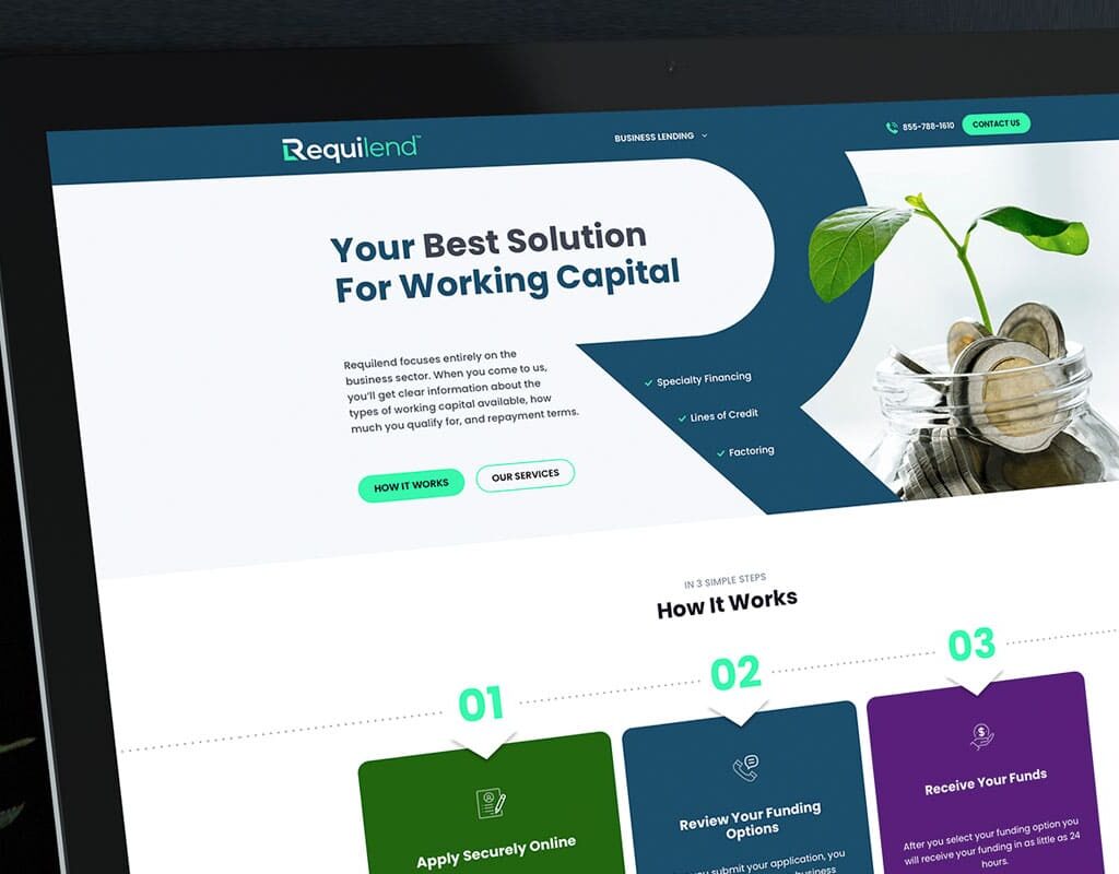
Helpful Tips for Creating Your Website’s Logo

During website development and design, a brand’s logo is one of the most critical pieces of content you’ll need to create. The logo is equally important as your site’s content and the quality of your user experience when crafting a successful...
Web Design and Client Communication

6 Ways to Communicate During Your Web Development Project

Building a new website isn’t just a project that succeeds with technical know-how. It also requires effective communication from all parties. As a client, you’d love to be able to step into that first meeting, tell your web agency what you...
Top Tips for Creating Images During the Web Design Process

Top Tips for Creating Images During the Web Design Process

Finding the right images for a site is one of the most important aspects of any web design process. While stock photography is always an option, lately, Google has stressed the importance of unique images across a site for improved search...
How to Choose the Right Domain Name for Your Website

Choosing the Right Domain Name for Your New Website

Domain names are sometimes overlooked as part of building a new website. Put effort into selecting a quality domain name! It’s very important, and there are several factors to consider in your decision.   Why is a Good Domain Name So...
Beginning Stage Of Web Design & Development

5 Risks of Indecisiveness in Web Design

A business owner’s website is often the first interaction any consumer has with a brand. So, you obviously want to make sure that your website is as close to perfect as it can be when web development is finished. While professional...

Ready for a Website That Looks Great on Every Device?

Give your Dallas audience the mobile experience they expect and deserve.